Data visualization is an integral part of data analysis, and for CBSE Class 12 students studying Information Practices (IP), learning how to create and interpret different types of graphs using Python’s Matplotlib library is crucial. Whether you’re preparing for practical exams or working on a data project, this guide will walk you through the creation of various types of graphs. From simple line graphs to more complex visualizations like heatmaps and bubble charts, we’ve got you covered!
Let’s explore how to create the following graphs using Python:
- Line Graph
- Bar Graph
- Histogram
- Scatter Plot
- Pie Chart
- Box Plot
- Area Plot
- Heatmap
- Bubble Chart
- Stacked Bar Chart
1. Line Graph
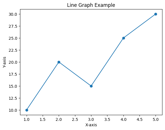
A line graph is ideal for representing data that changes over time, showing trends or patterns.
Python Code:
import matplotlib.pyplot as plt

x = [1, 2, 3, 4, 5]
y = [10, 20, 15, 25, 30]

plt.plot(x, y, marker='o')
plt.title("Line Graph Example")
plt.xlabel("X-axis")
plt.ylabel("Y-axis")
plt.show()
Output:
A graph with a line connecting data points, useful for showing a trend or pattern over time.
2. Bar Graph
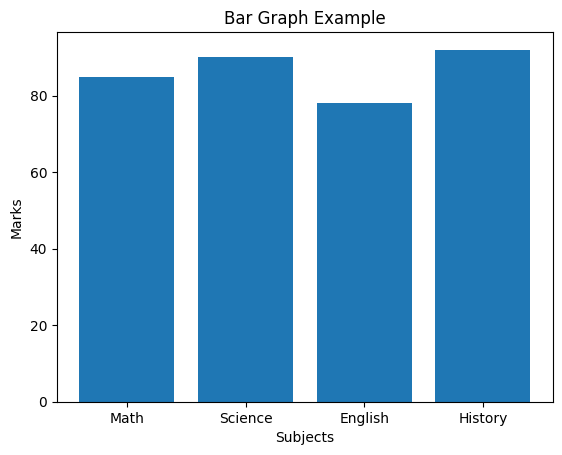
Bar graphs are used to compare quantities across different categories, such as exam scores of students in different subjects.
Python Code:
import matplotlib.pyplot as plt

categories = ['Math', 'Science', 'English', 'History']
values = [85, 90, 78, 92]

plt.bar(categories, values)
plt.title("Bar Graph Example")
plt.xlabel("Subjects")
plt.ylabel("Marks")
plt.show()
Output:
A bar chart showing the marks obtained in various subjects.
3. Histogram
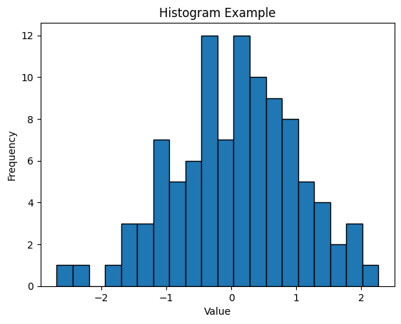
Histograms display the distribution of data. For example, you can use it to show the frequency of marks obtained by students in a class.
Python Code:
import matplotlib.pyplot as plt
import numpy as np

data = np.random.randn(100)

plt.hist(data, bins=20, edgecolor='black')
plt.title("Histogram Example")
plt.xlabel("Value")
plt.ylabel("Frequency")
plt.show()
Output:
A histogram representing the frequency distribution of a dataset.
4. Scatter Plot
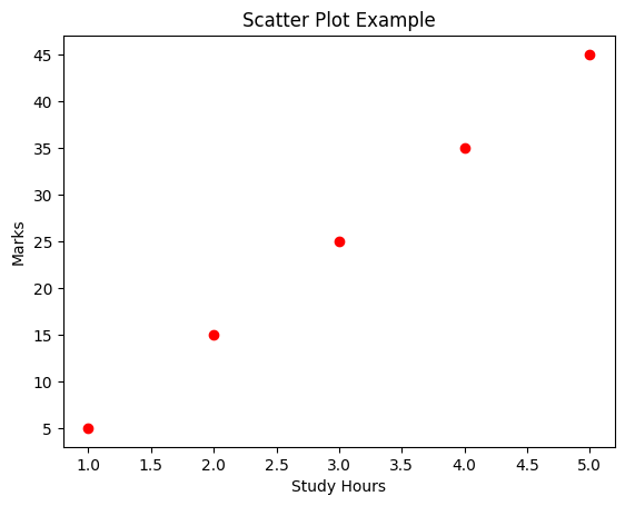
A scatter plot is used to find relationships between two sets of data, such as study time and exam scores.
Python Code:
import matplotlib.pyplot as plt

x = [1, 2, 3, 4, 5]
y = [5, 15, 25, 35, 45]

plt.scatter(x, y, color='r')
plt.title("Scatter Plot Example")
plt.xlabel("Study Hours")
plt.ylabel("Marks")
plt.show()
Output:
A scatter plot showing the relationship between hours of study and marks obtained.
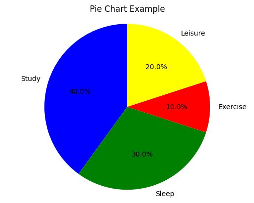
5. Pie Chart
Pie charts are perfect for showing proportions. You can use them to show the percentage of time you spend on different activities in a day.
Python Code:
import matplotlib.pyplot as plt

labels = ['Study', 'Sleep', 'Exercise', 'Leisure']
sizes = [40, 30, 10, 20]
colors = ['blue', 'green', 'red', 'yellow']

plt.pie(sizes, labels=labels, colors=colors, autopct='%1.1f%%', startangle=90)
plt.title("Pie Chart Example")
plt.axis('equal')  # Equal aspect ratio ensures the pie chart is circular.
plt.show()
Output:
A pie chart representing how time is spent on various activities.
6. Box Plot
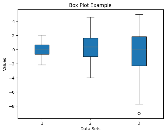
Box plots are great for visualizing data distribution and identifying outliers in your dataset, such as the range of marks in a class.
Python Code:
import matplotlib.pyplot as plt
import numpy as np

data = [np.random.normal(0, std, 100) for std in range(1, 4)]

plt.boxplot(data, patch_artist=True)
plt.title("Box Plot Example")
plt.xlabel("Data Sets")
plt.ylabel("Values")
plt.show()
Output:
A box plot showing the distribution of data with quartiles and potential outliers.
7. Area Plot
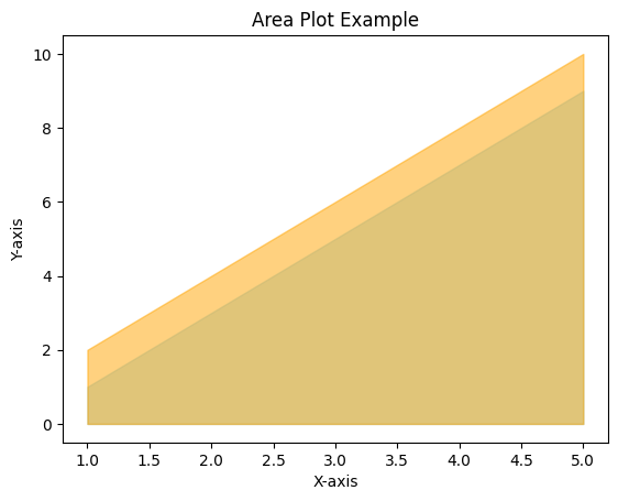
Area plots are similar to line plots but with the area under the line filled in, making them useful for showing cumulative data like total study time.
Python Code:
import matplotlib.pyplot as plt

x = [1, 2, 3, 4, 5]
y1 = [1, 3, 5, 7, 9]
y2 = [2, 4, 6, 8, 10]

plt.fill_between(x, y1, color="skyblue", alpha=0.5)
plt.fill_between(x, y2, color="orange", alpha=0.5)
plt.title("Area Plot Example")
plt.xlabel("X-axis")
plt.ylabel("Y-axis")
plt.show()
Output:
An area plot displaying the filled area between lines.
8. Heatmap
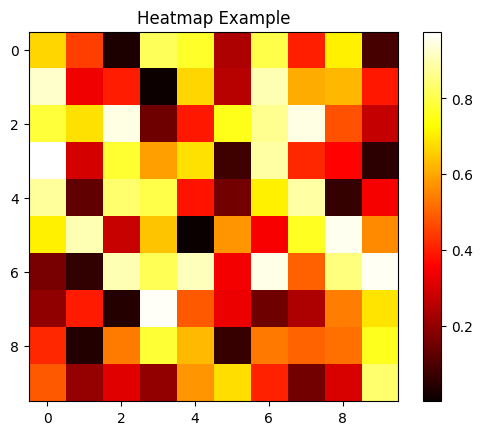
A heatmap is used to visualize matrix-like data, such as marks obtained by different students across subjects.
Python Code:
import matplotlib.pyplot as plt
import numpy as np

data = np.random.random((10, 10))

plt.imshow(data, cmap='hot', interpolation='nearest')
plt.title("Heatmap Example")
plt.colorbar()
plt.show()
Output:
A heatmap that shows values in different shades, depending on their intensity.
9. Bubble Chart
A bubble chart is a variation of a scatter plot, where the size of the data points is used to represent an additional variable.
Python Code:
import matplotlib.pyplot as plt

x = [1, 2, 3, 4, 5]
y = [10, 20, 25, 30, 35]
sizes = [100, 200, 300, 400, 500]

plt.scatter(x, y, s=sizes, alpha=0.5, color='green')
plt.title("Bubble Chart Example")
plt.xlabel("X-axis")
plt.ylabel("Y-axis")
plt.show()
Output:
A bubble chart where the size of each bubble represents a third dimension of the data.

10. Stacked Bar Chart
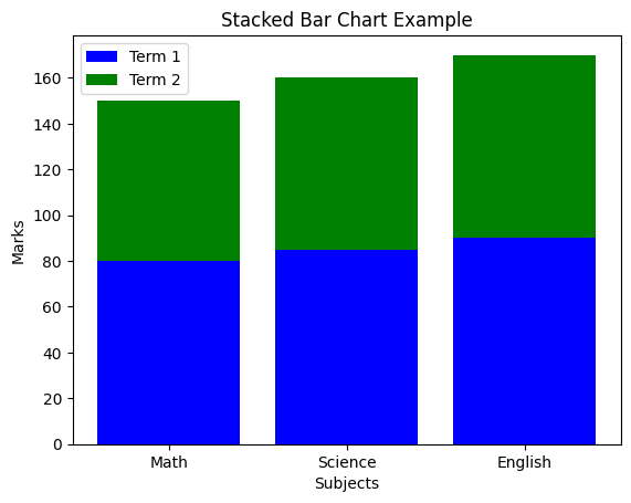
Stacked bar charts show the composition of categories within the overall bar, useful for comparing performance across subjects.
Python Code:
import matplotlib.pyplot as plt

categories = ['Math', 'Science', 'English']
values1 = [80, 85, 90]
values2 = [70, 75, 80]

plt.bar(categories, values1, color='blue', label='Term 1')
plt.bar(categories, values2, bottom=values1, color='green', label='Term 2')
plt.title("Stacked Bar Chart Example")
plt.xlabel("Subjects")
plt.ylabel("Marks")
plt.legend()
plt.show()
Output:
A stacked bar chart comparing marks across two terms for different subjects.
Conclusion
Mastering different types of graphs in Python using the Matplotlib library is a key skill for CBSE Class 12 IP students, especially as data visualization is becoming an essential part of Information Practices. By learning how to create these graphs, you can effectively present your data analysis in your projects and exams.
Whether you’re creating a line graph to show trends, a pie chart to visualize proportions, or a heatmap to depict intensity, each type of graph has its unique use. Practice these examples to excel in your practical exams and become proficient in Python for data visualization!
Happy Coding from ITXperts!
This blog has covered essential graph types that are part of the Class 12 IP practicals for the 2024-25 session. With these examples, you are all set to ace your practicals and enhance your data presentation skills!

Leave a Reply