
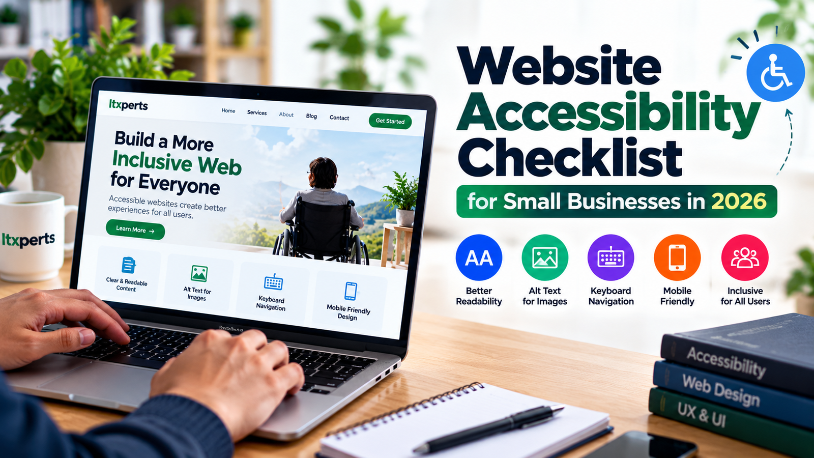
A website can look polished and still be difficult for some people to use. Small text, low-contrast buttons, unlabeled forms, and menus that require a mouse can prevent visitors from finding information or contacting your business. Website accessibility means designing and building pages so people with different abilities can perceive, navigate, understand, and interact with them.
You do not need to rebuild every page at once. Start with this practical website accessibility checklist for small businesses, then make accessibility part of your normal design, content, and maintenance process.
1. Check text and colour contrast
Body text should be easy to read against its background. Avoid pale grey text on white, text placed over busy photos, and buttons whose labels blend into the background. WCAG 2.2 Level AA generally calls for a contrast ratio of at least 4.5:1 for normal text and 3:1 for large text. Use a contrast checker rather than relying on appearance alone.
2. Add useful alternative text to meaningful images
Write concise alt text that communicates the purpose or information in an image. For example, an image showing a team at work might use “Itxperts web development team reviewing a website layout” if that accurately describes the image. Decorative images should usually have empty alt text so assistive technology can skip them. Avoid stuffing alt text with keywords or repeating the same phrase on every image.
3. Make every page usable with a keyboard
Try navigating your website without a mouse. Press Tab to move through links, buttons, menus, and form fields, and use Enter or Space where appropriate. The current focus should always be visible. Dropdowns, pop-ups, carousels, and mobile menus must not trap keyboard users or hide where focus has moved.
4. Use clear headings and link text
Give each page a clear main heading, then organise sections with logical H2 and H3 headings. Do not choose heading levels only because of their visual size. Link text should explain its destination: “Read our WordPress speed optimization guide” is more useful than “click here.” A clear structure also helps visitors scan content quickly.
5. Label forms and explain errors
Contact, enquiry, registration, and checkout forms need visible labels that remain available while a visitor types. Do not rely only on placeholder text. Identify required fields, explain the expected format, and show error messages in plain language. Errors should be associated with the relevant field, and colour should not be the only way they are communicated.
6. Review mobile usability and zoom
Check pages on a small screen and zoom in to 200%. Content should remain readable without forcing unnecessary horizontal scrolling. Buttons and links should have enough space to tap accurately, and important actions should not depend on hover effects. Test menus, tables, cookie notices, and forms—not only the homepage.
7. Provide captions and accessible documents
Add captions to videos that contain speech and provide transcripts when useful. If you publish PDFs, check that the text can be selected, the reading order makes sense, and the document is not simply a scan of a page. When practical, publish essential information as normal HTML text as well.
8. Run automated checks—and test manually
Automated accessibility tools can detect many common issues, but they cannot confirm that every task is understandable or usable. Combine an automated scan with keyboard testing and a review of real user journeys, such as submitting a contact form or completing a purchase. The official W3C Web Accessibility Initiative testing and evaluation guidance is a useful starting point.
Accessibility also overlaps with good site structure and performance. For related improvements, see our guides to WordPress speed optimization tools and AI website builders.
A quick accessibility review checklist
- Text and buttons have sufficient contrast.
- Meaningful images have accurate alt text.
- All interactive controls work with a keyboard and show focus.
- Headings and links describe the page structure and destination.
- Forms have visible labels and understandable error messages.
- Pages work on mobile and when zoomed in.
- Videos and important documents have accessible alternatives.
- Automated checks are supplemented with manual testing.
Final thoughts
Website accessibility is an ongoing quality practice, not a one-time plugin installation or a promise that a site is automatically compliant. Prioritise barriers that stop people from reading, navigating, or completing important tasks. Retest after theme changes, plugin updates, redesigns, and new content. For legal obligations that apply to your organisation or customers, consult qualified accessibility and legal professionals.